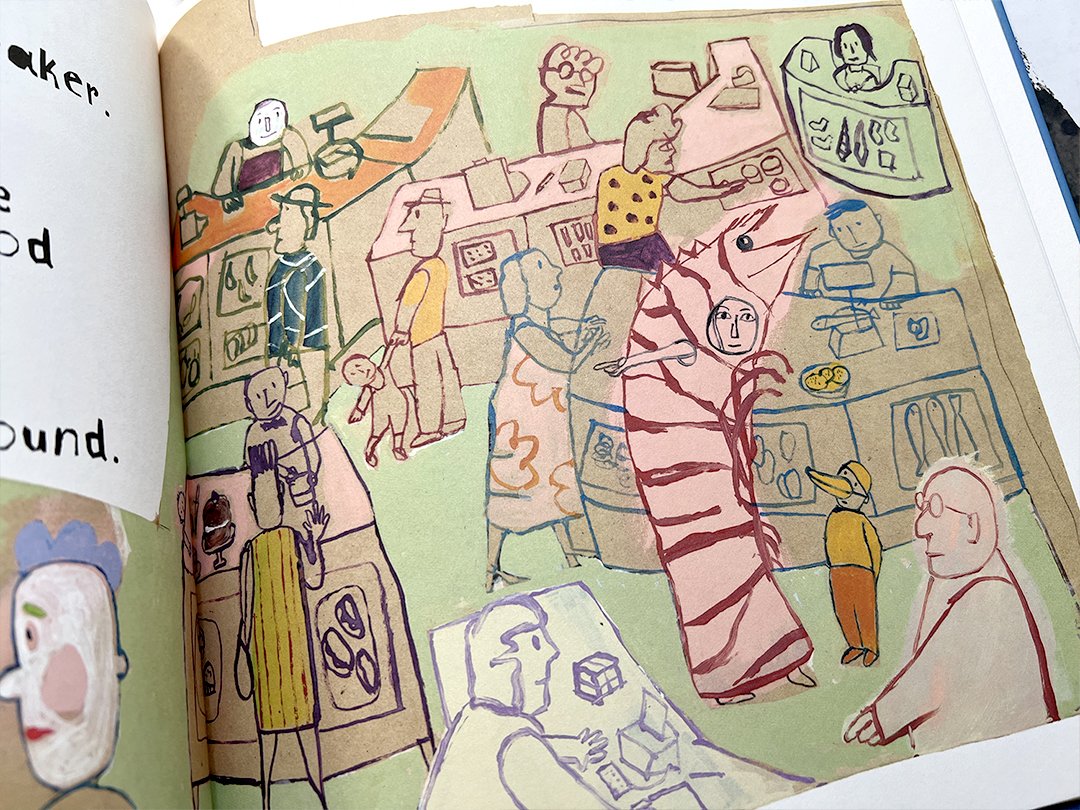
Seasonal wood-free offerings from WM Books. Jacketed hardbacks with linen case material.
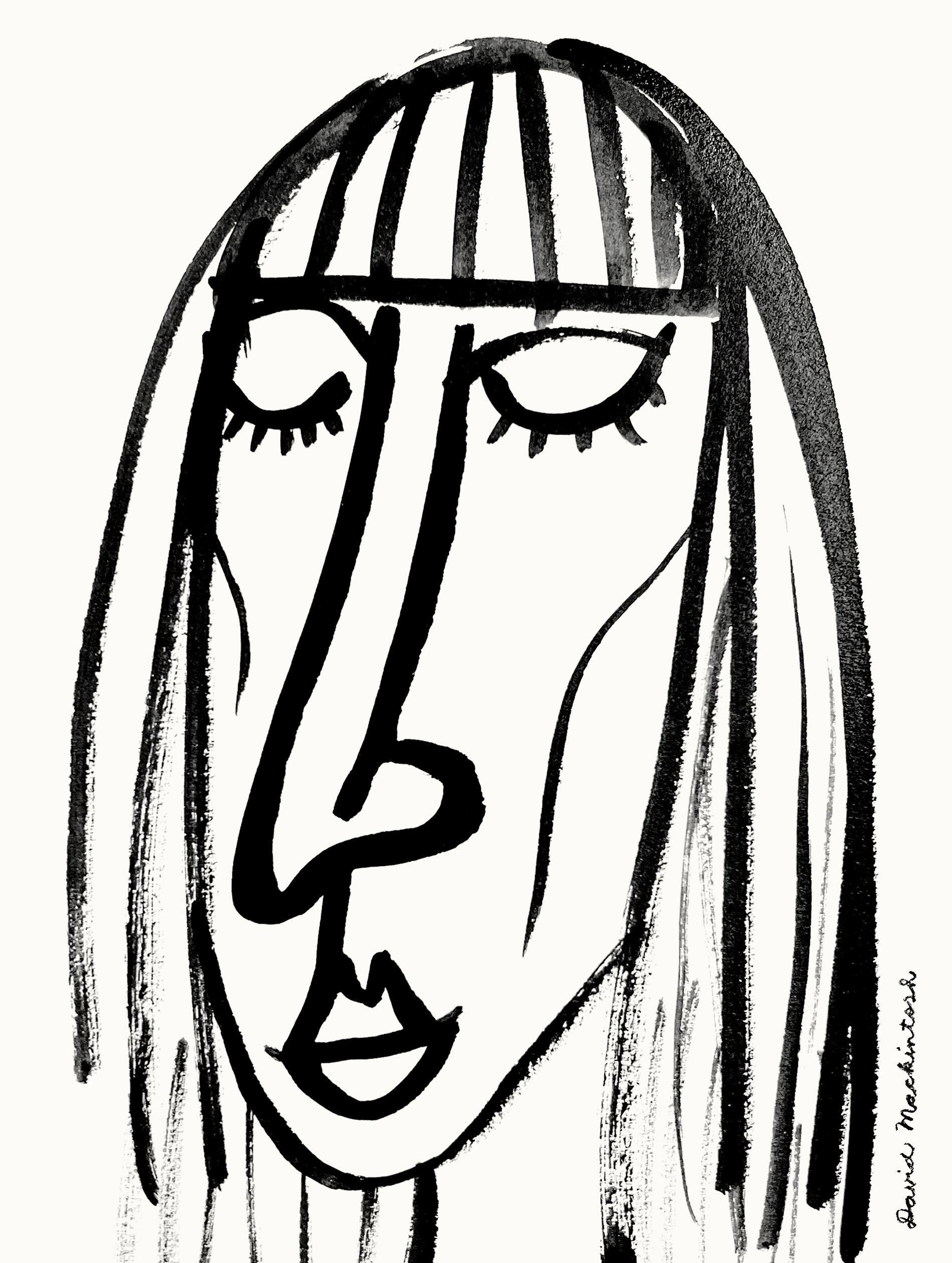
Cover design and illustration © David Mackintosh.

Seasonal wood-free offerings from WM Books. Jacketed hardbacks with linen case material.
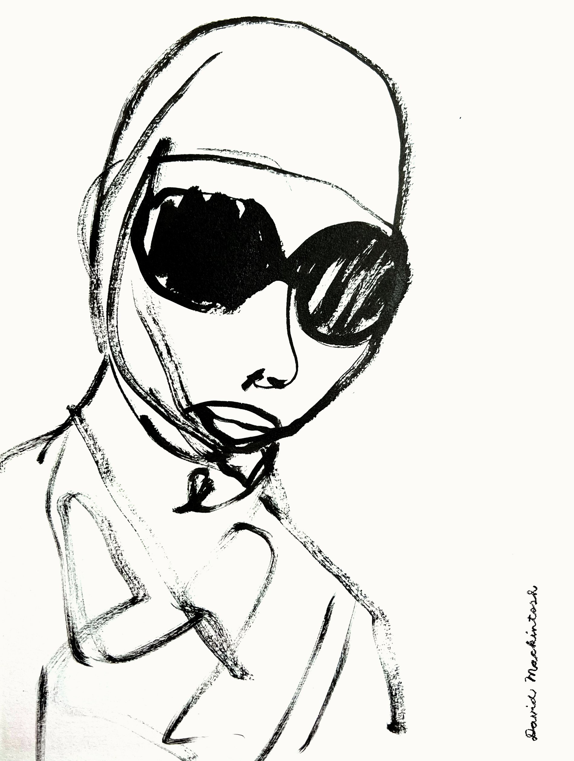
Cover design and illustration © David Mackintosh.
I stretch in the morning a lot and I do a lot of saunas and steam rooms during fashion week just to keep my blood flowing. – Gigi Hadid
Loki the Dog from Next Door sniffed out the Hen dog toy within one minute of walking into the studio. He gave up the fight moments later citing the adorable plush’s rugged construction.
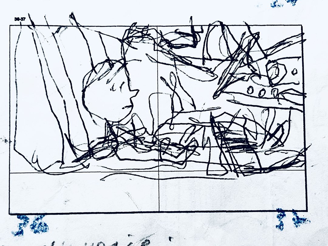
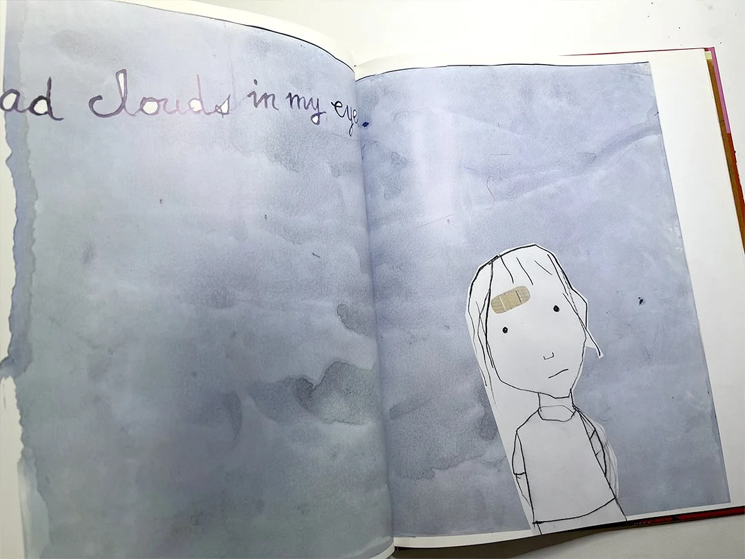
The young characters in a new book are viewing life from the seat in their parents cars. (see pictures).
As a child, I was used to spending a lot of time being driven all over the place, whilst having no control over the destination. Even if I knew where we were going, there was almost definitely other unannounced stops made in between. And they often included visits to a hairdresser, or grocery shopping, or dropping in to chat with someone my parents hadn’t seen for ages “because we’re passing”.
I became interested in the details of the car dashboard, and the backs of the front seats too (although there’s not much interesting about those). And it was in friends’ parent’s cars being taken to sporting events and such things that I discovered the huge variety of car interior designs.
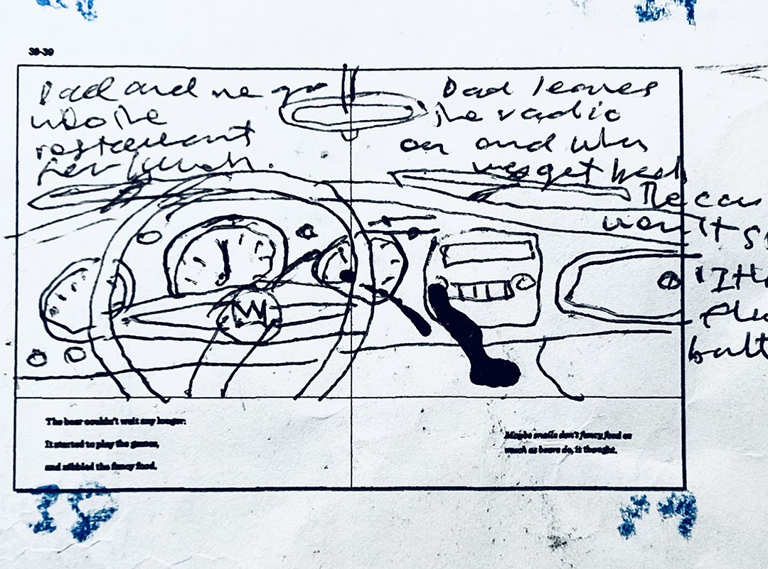
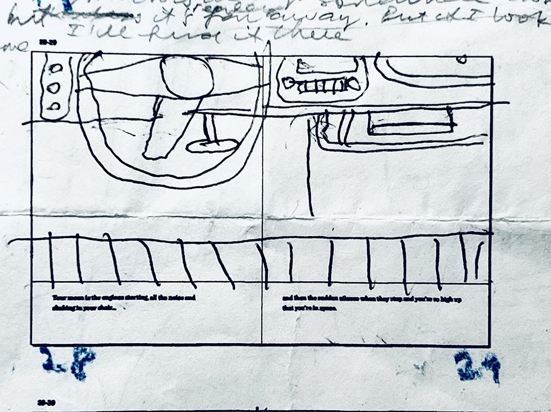
Once, I noticed that my friend’s mother’s car only had two pedals, compared to ours with three. When asked, my dad laboriously explained the difference between automatic and manual transmission, complete with drawings on a piece of paper. For weeks I visualised the clutch plate spinning and the drivetrain engaging and all this happening every time the gears were changed. Automatic transmission seemed to make more sense: two pedals, stop and go. But I was a manual transmission person and always will be – because my dad had a manual.
You never get a second chance to make a first impression. That is what I read on the side of a box of spiral binders when I worked in the print room of an engineering office.

HONK! If you see one of our company fleet vehicles.
Due to unprecedented demand during London Fashion Week, the profuselyillustrated notebook t-shirt has been reprinted. Two sizes: large and medium. Order yours now or risk cancellation by fashionistas in your neighbourhood.

Shirt: Model’s own.
Chris McKimmie had a desk in the college staff room that was against a wall. On the wall behind the desk lamp was a poster for a band called The Martinis, in which he was the drummer. I saw them play a few times at the Caxton Street Brasserie and at a party. The band was good, but I was really impressed by this poster which was on white paper and was a blend of two inks (a rainbow print) with black.
The poster was mostly lettering in ink with a brush and a pen, and every time I went to the staff room, I found myself glancing at it. The edges were torn off and the corners were peppered in holes from thumb tacks. The poster was about A2 size, and the drawing felt as though it was made at a smaller scale and blown up to the print size.
Today, I often think about this poster and I know why I liked it so much. It was because of the boundless freedom of the drawing and the energy in it. It was humorous, and classy and very graphic, without being slick. It was playful and effortlessly expressive. It was as though someone was whistling a drawing.
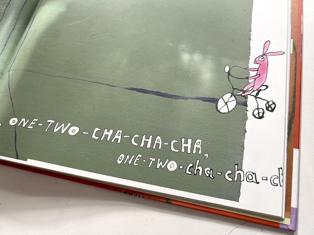
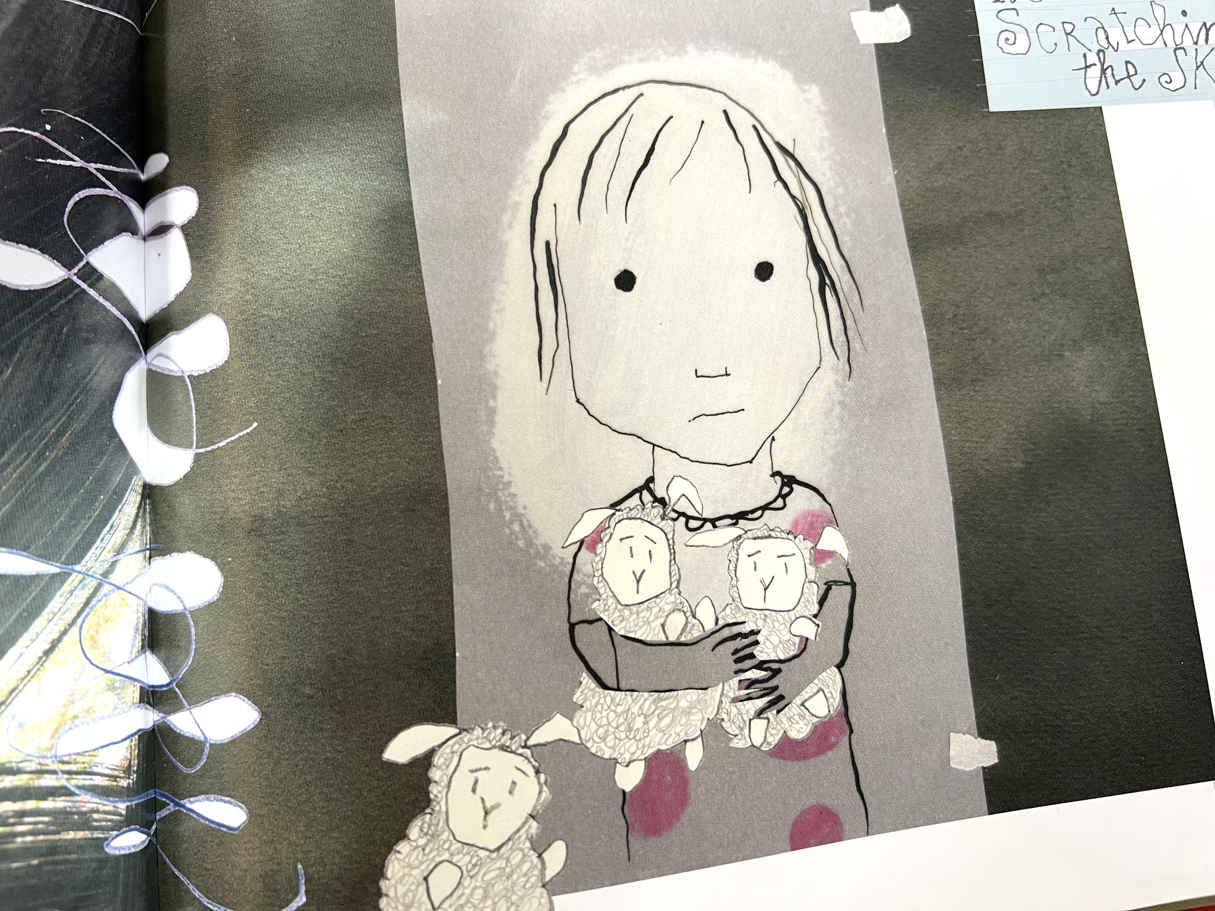
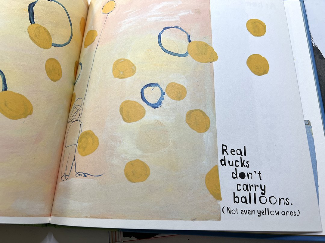
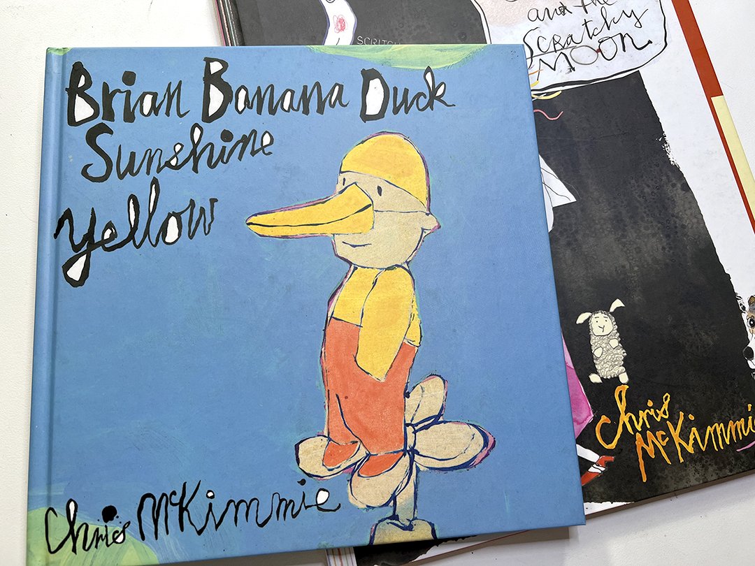
Looking at Chris’s picture books, I can see how much he was enjoying making them. He broke a lot of conventions in the way he made them (all the hand lettering in 4-colour process!). At face value, one could be mistaken that they were looking at a drawing for drawing’s sake, but the narrative always shone through.
I should have asked for a copy of that poster, but it seems like it’s seared into my memory and it and his teaching has been a real inspiration ever since.

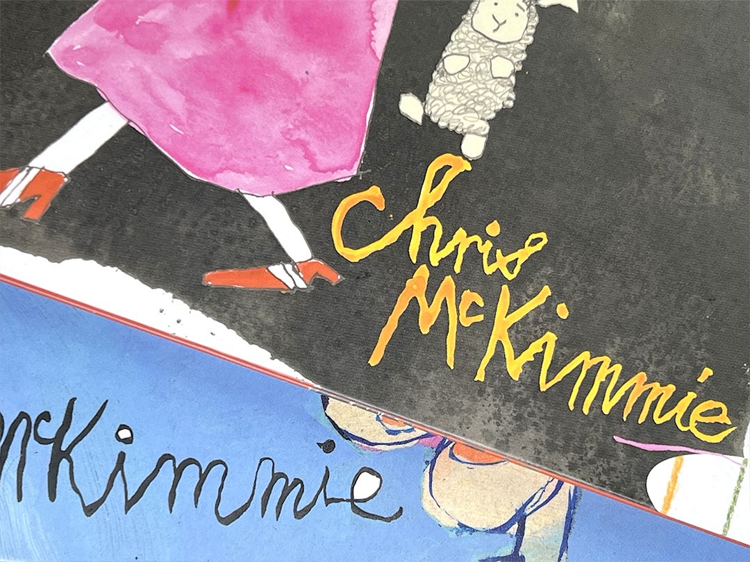
Chris: shooting the breeze and drawing.
These medieval socks in the Victoria and Albert Museum are in really good shape. The accompanying label says that they are for wearing with sandals. They have satin lining too.

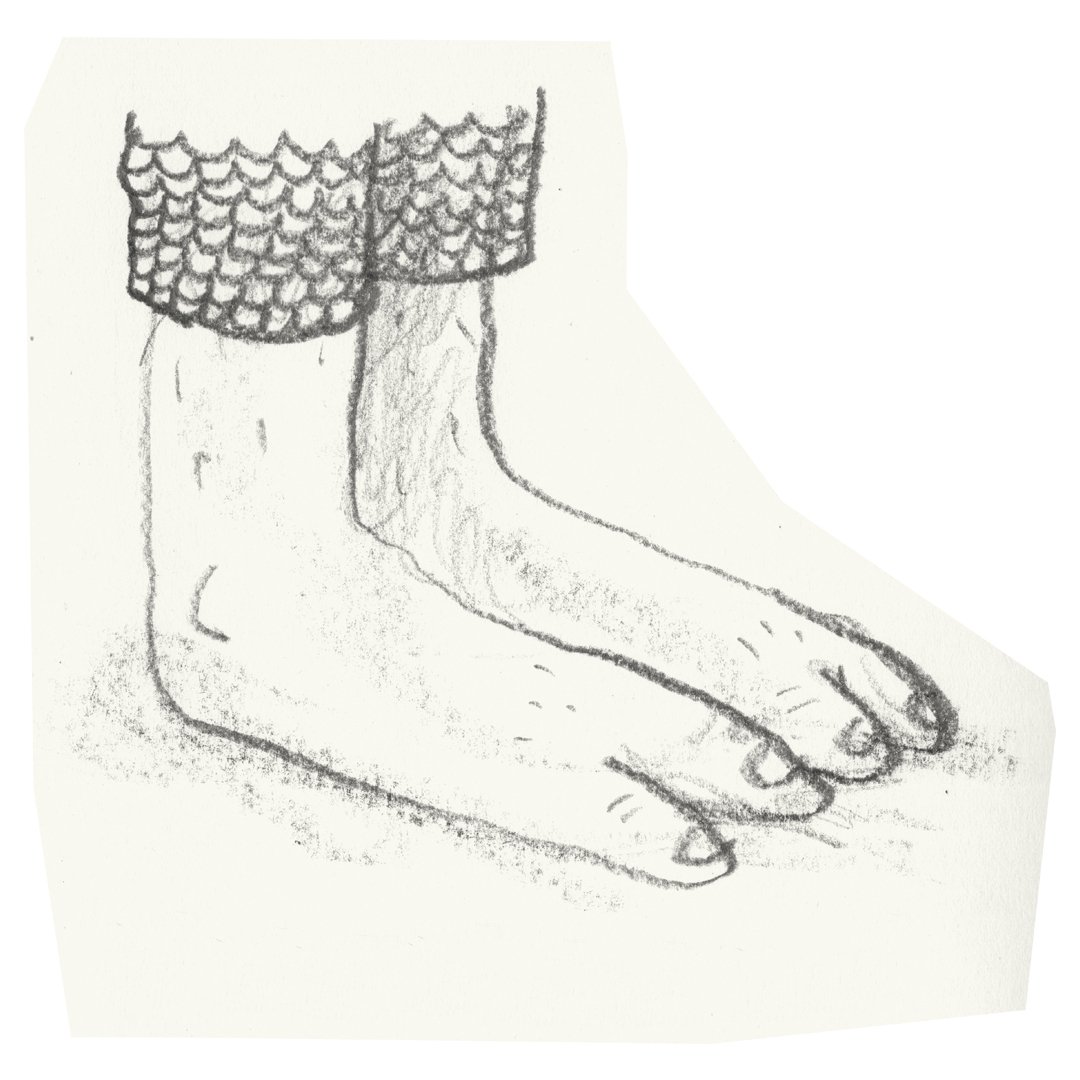
Medieval feet.
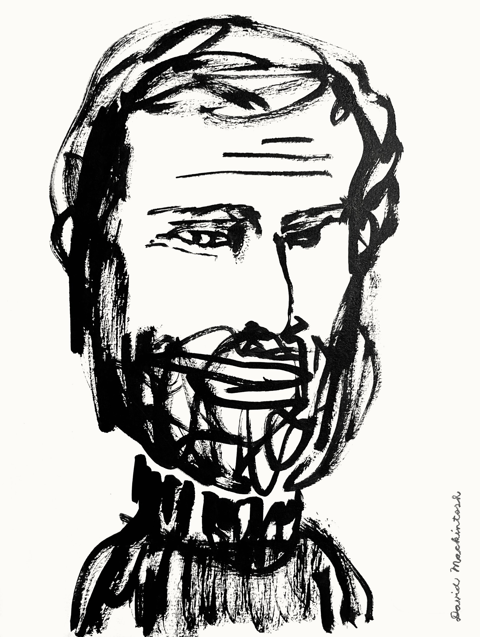
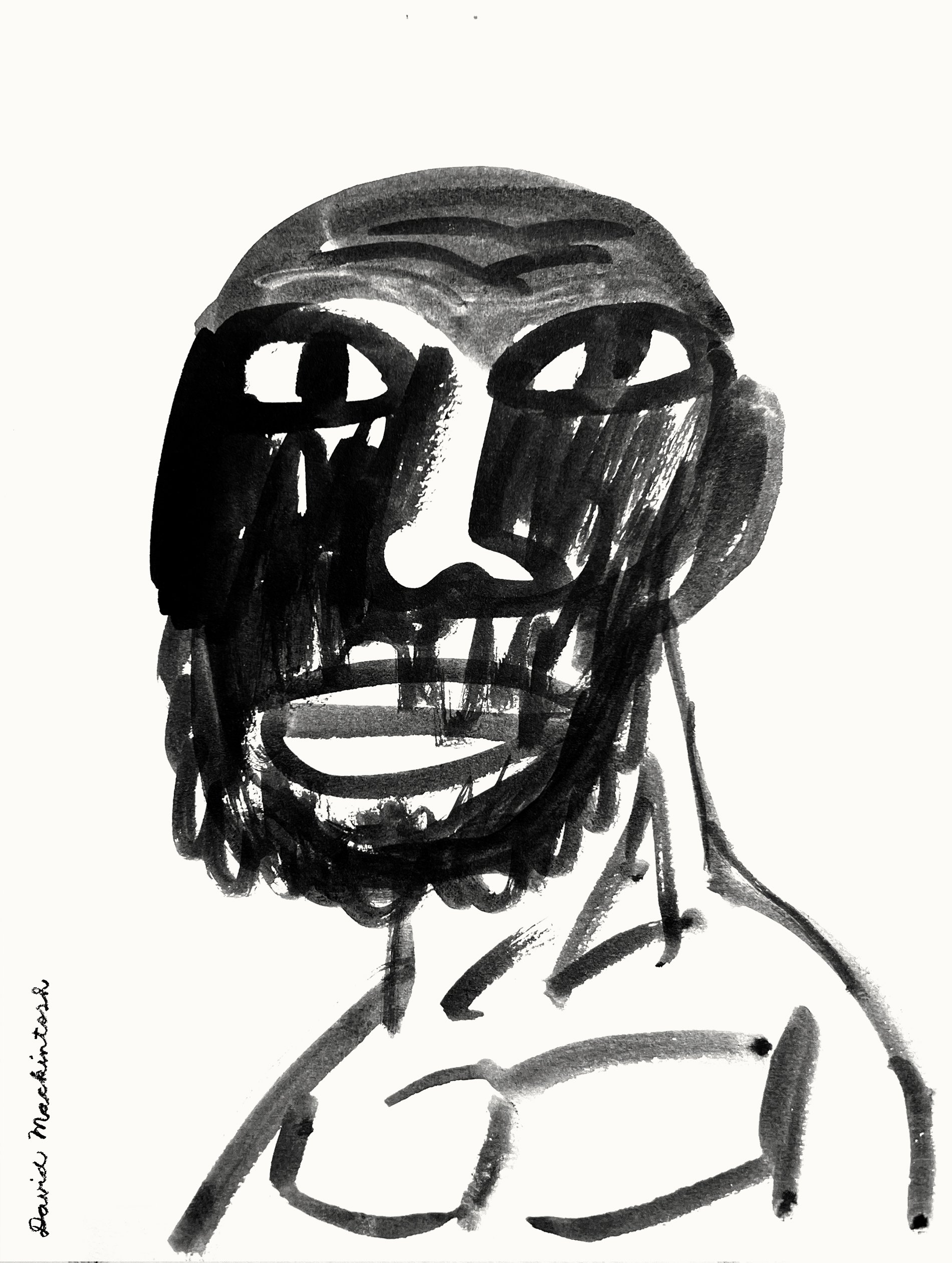
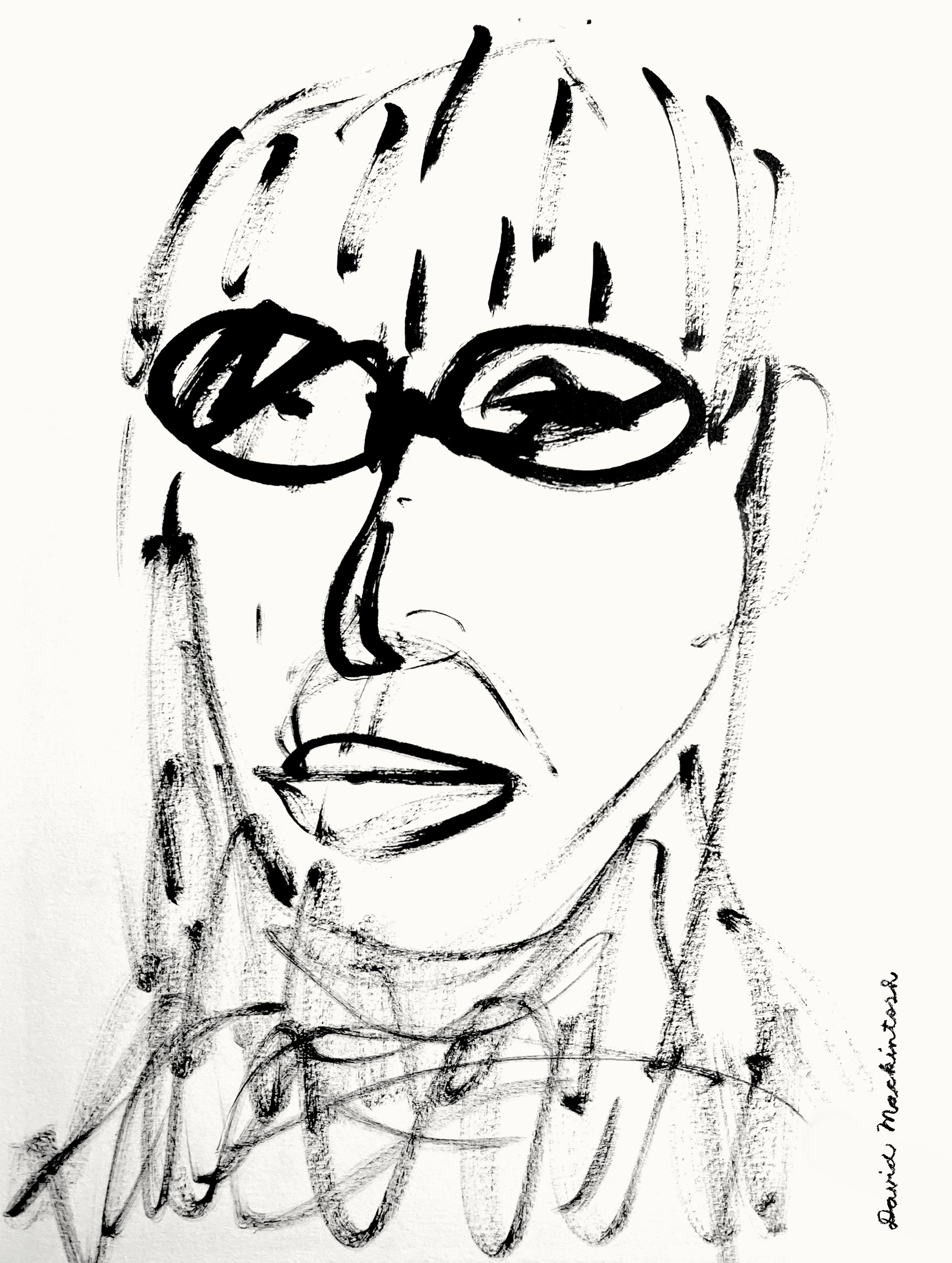
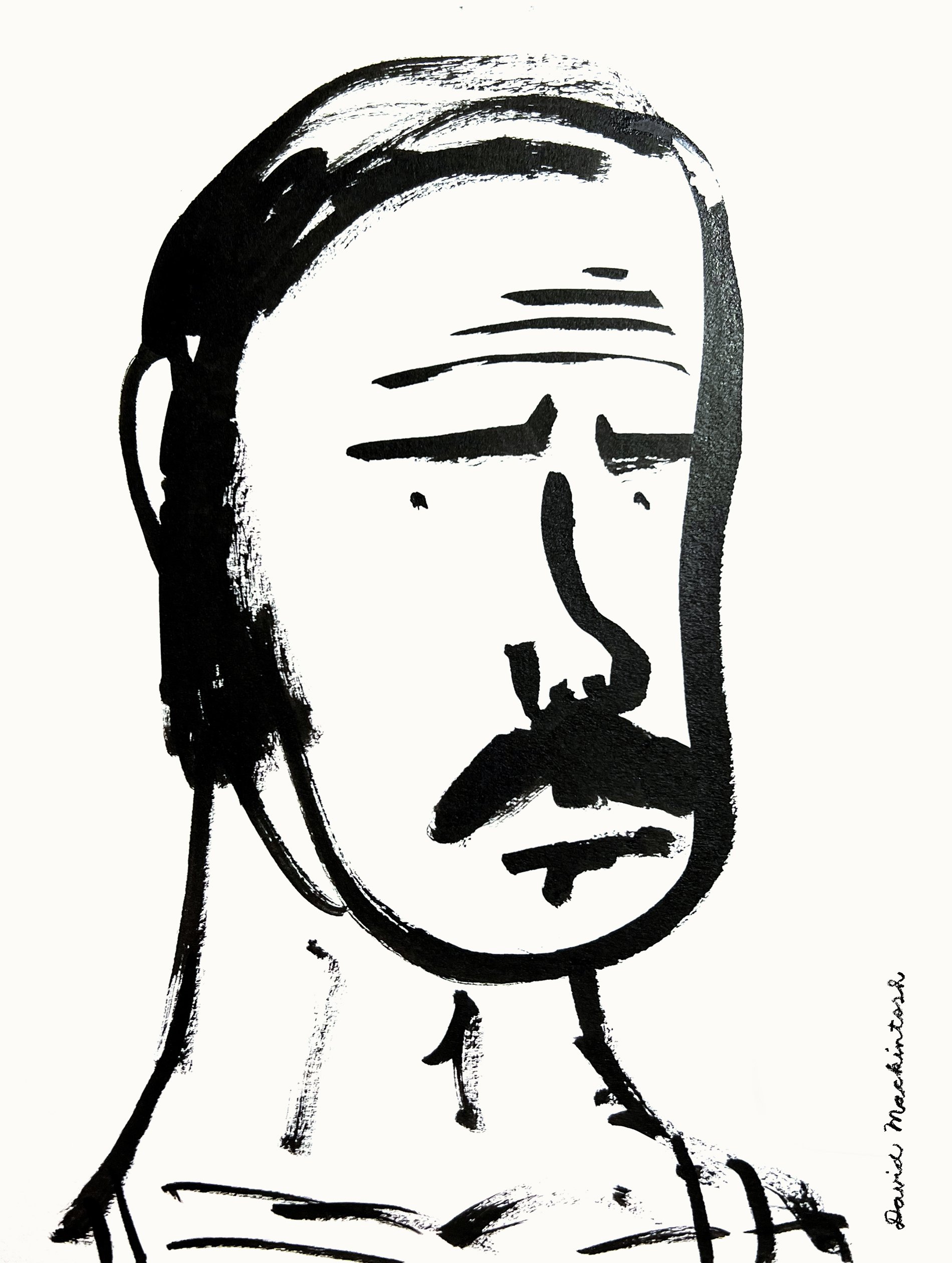
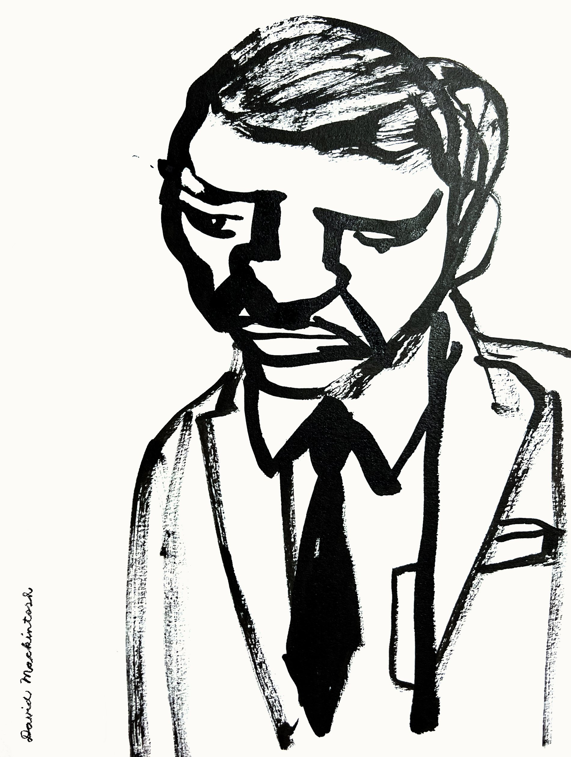
Past Prime Ministers of England: In no particular order. Starting with the second last one.

Boris Johnson (2019-2022)
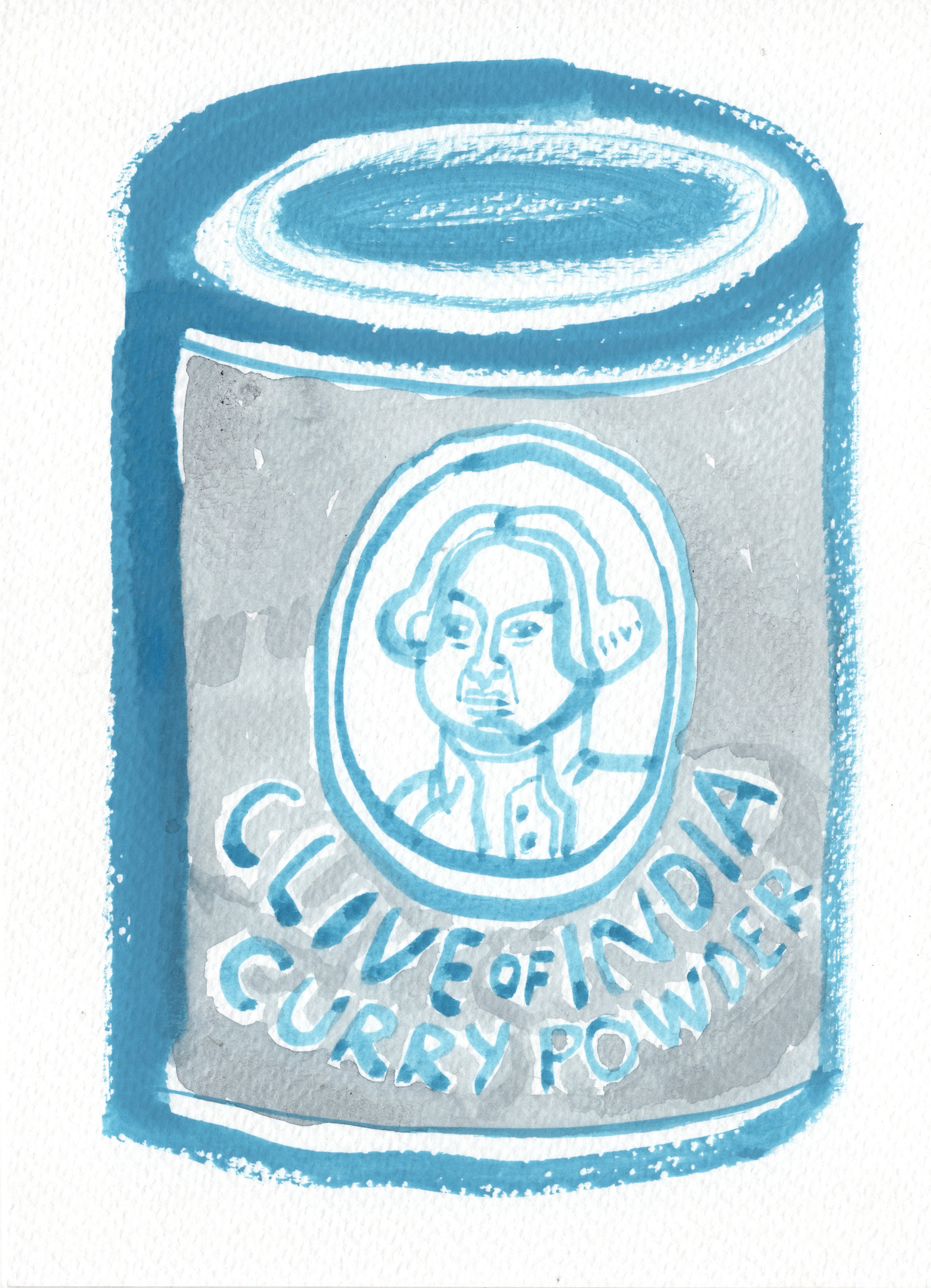
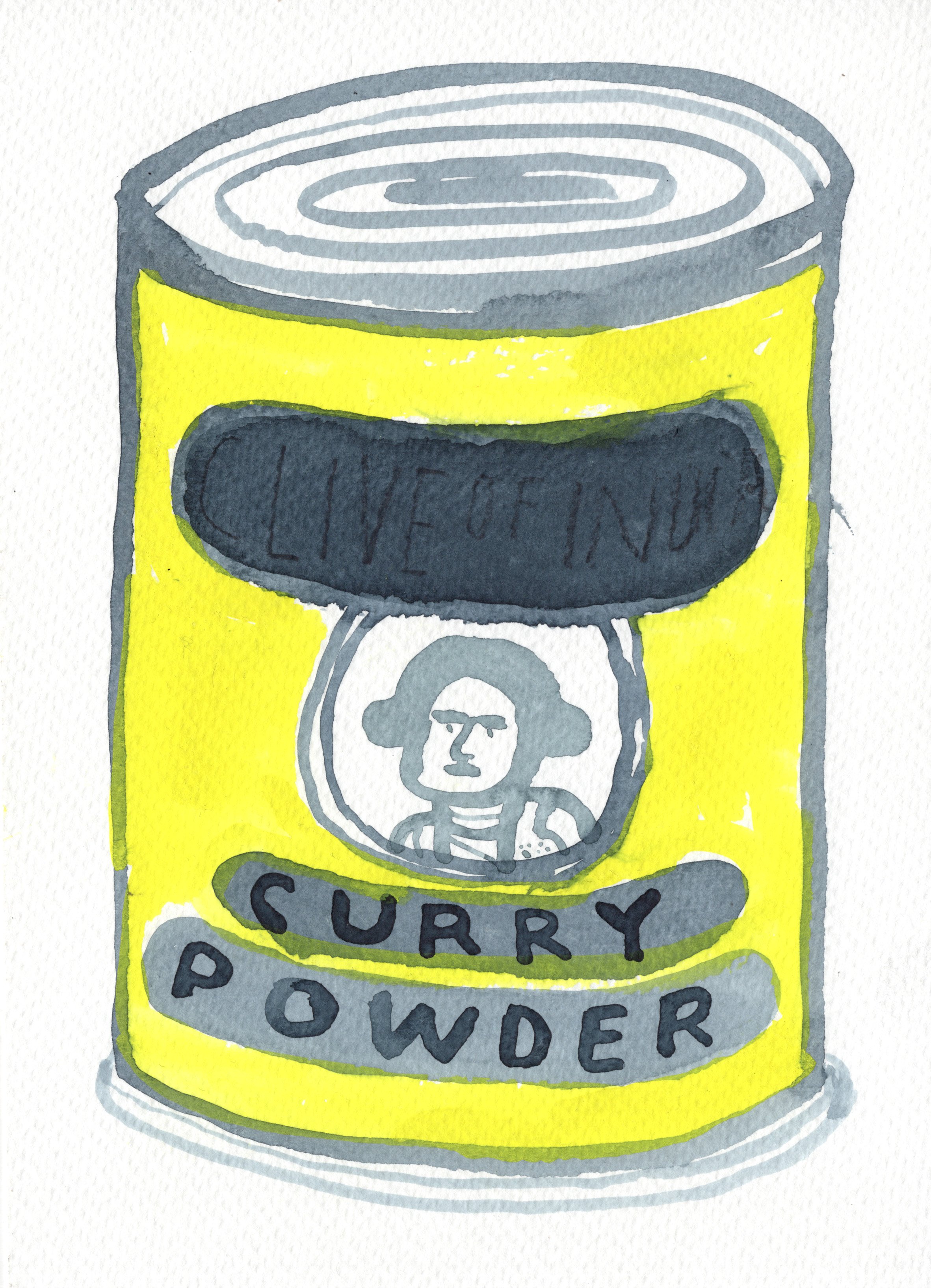
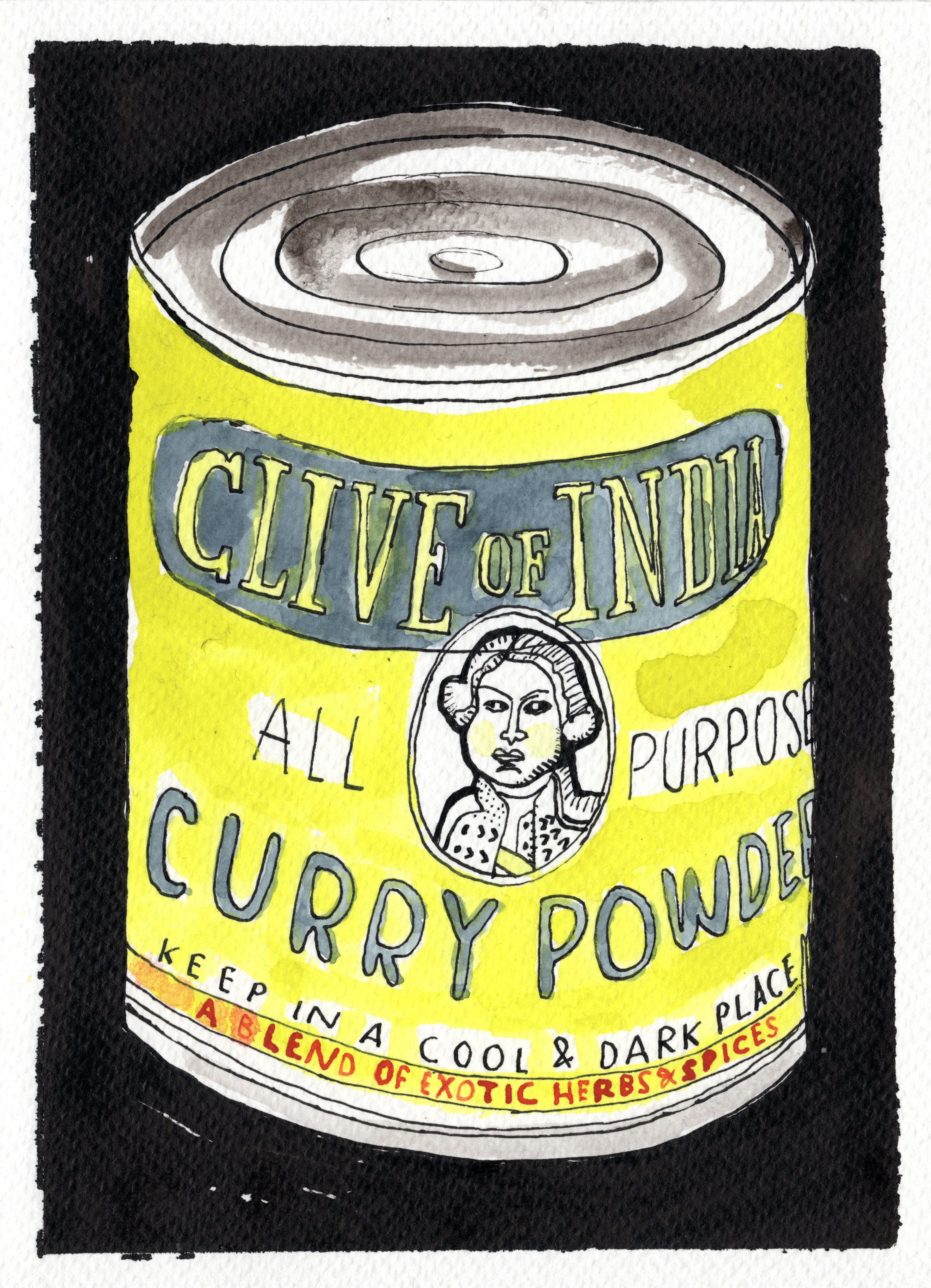
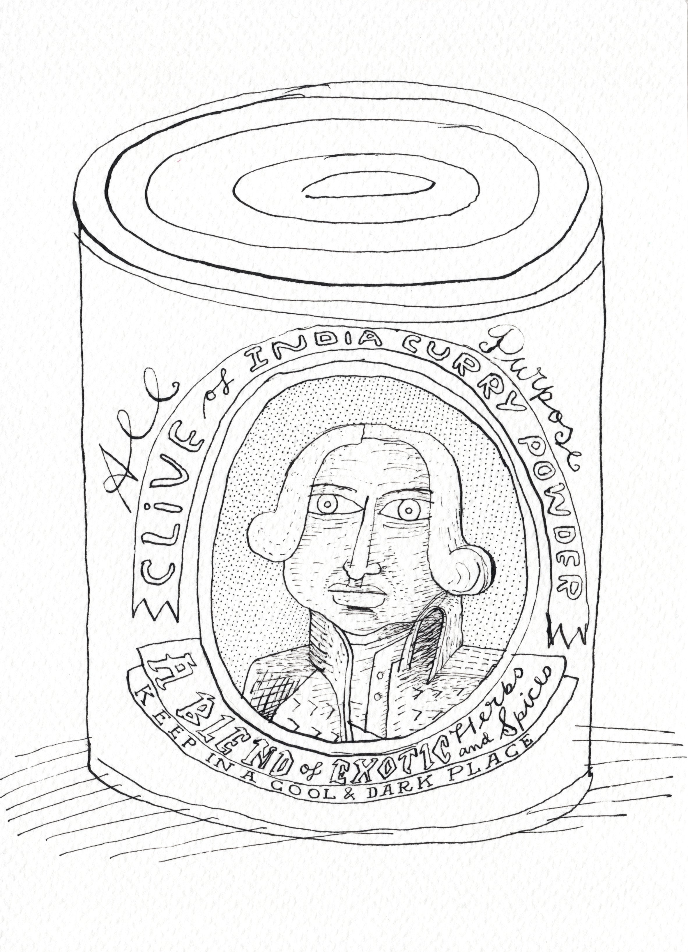
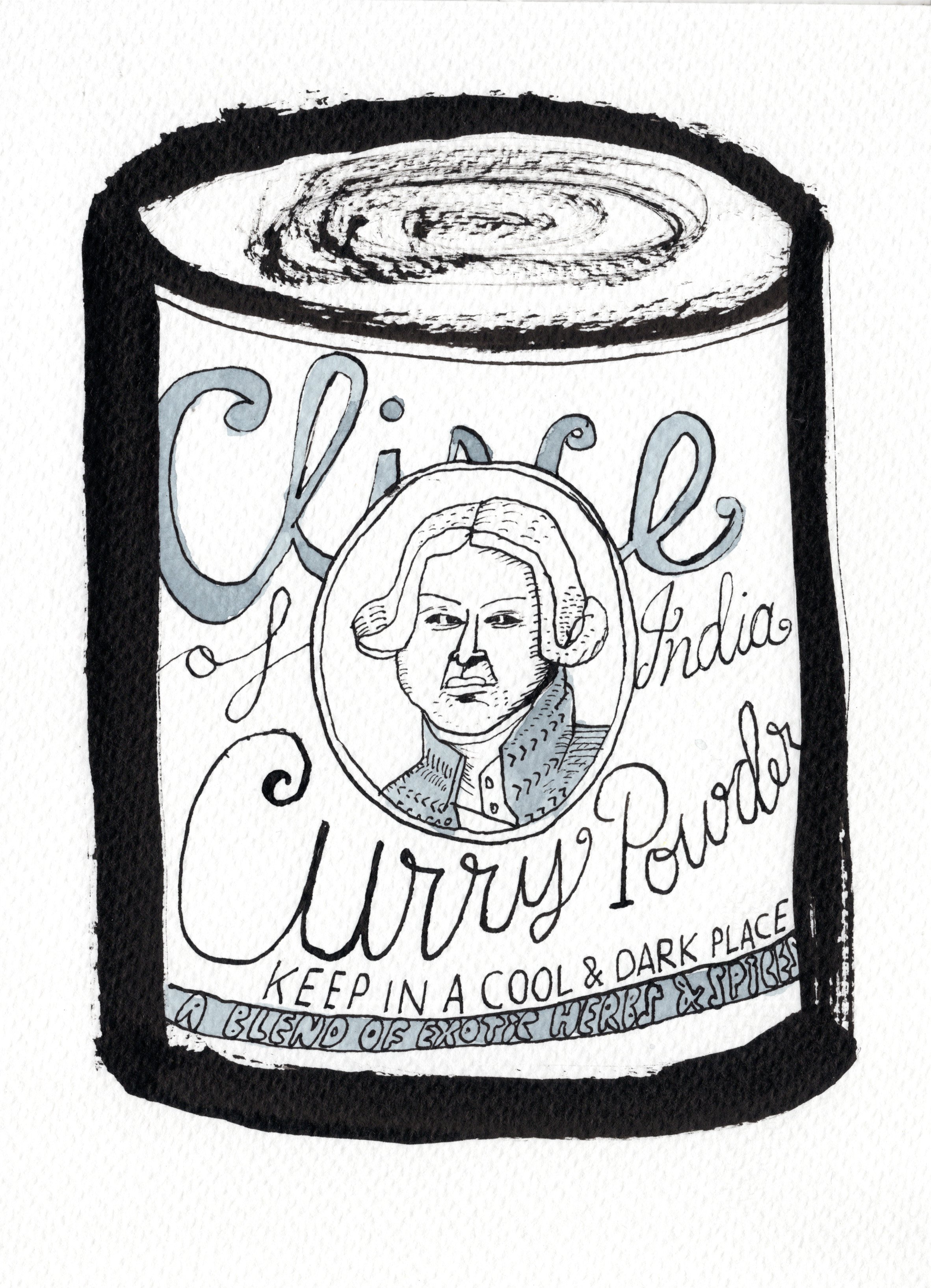
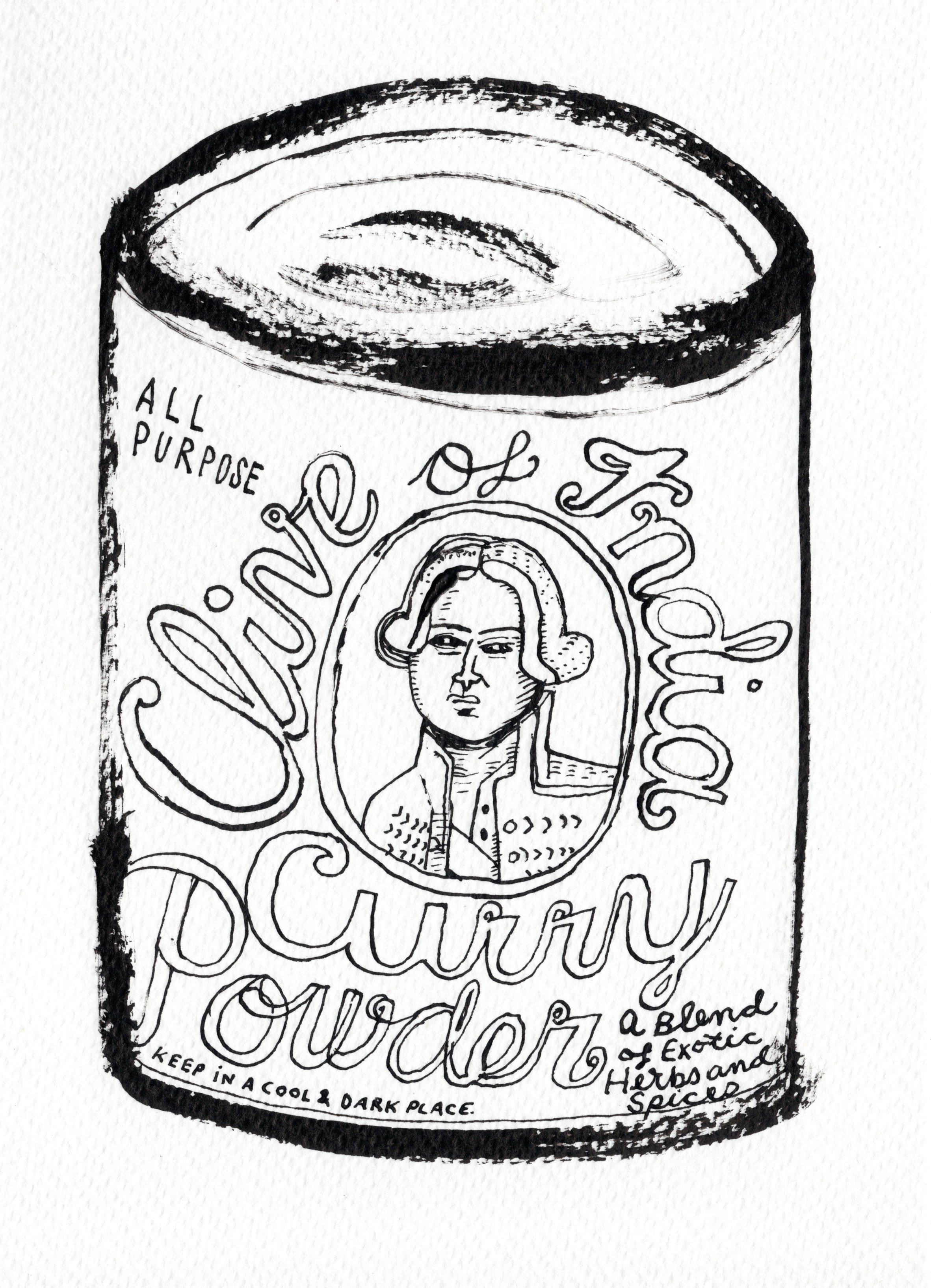
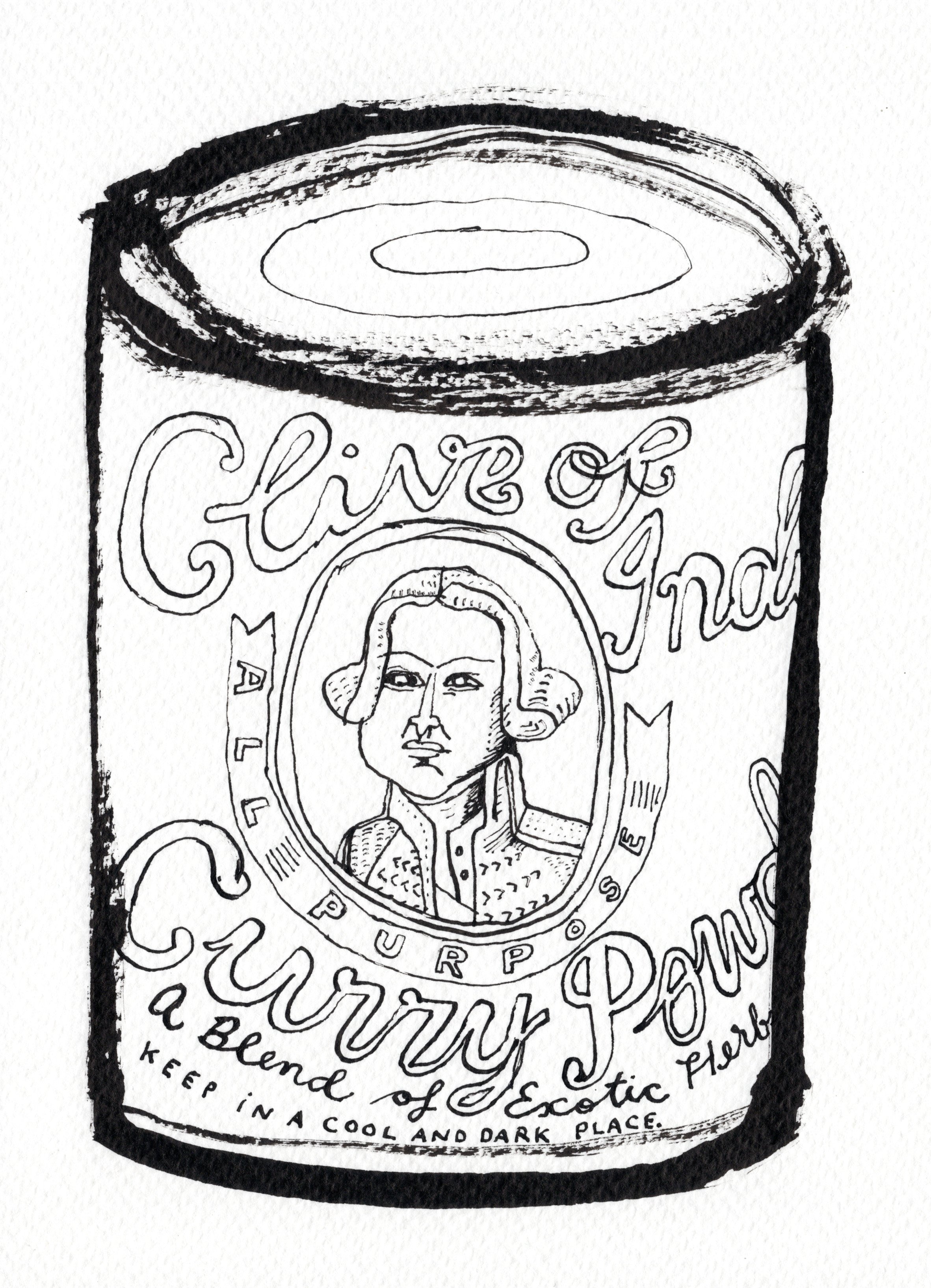
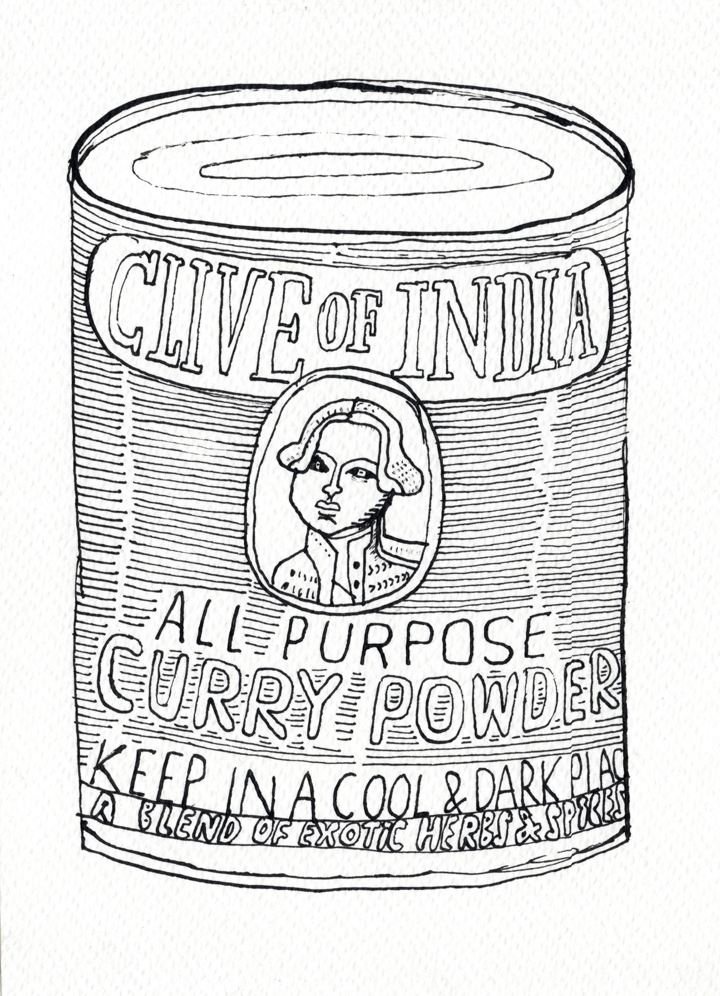
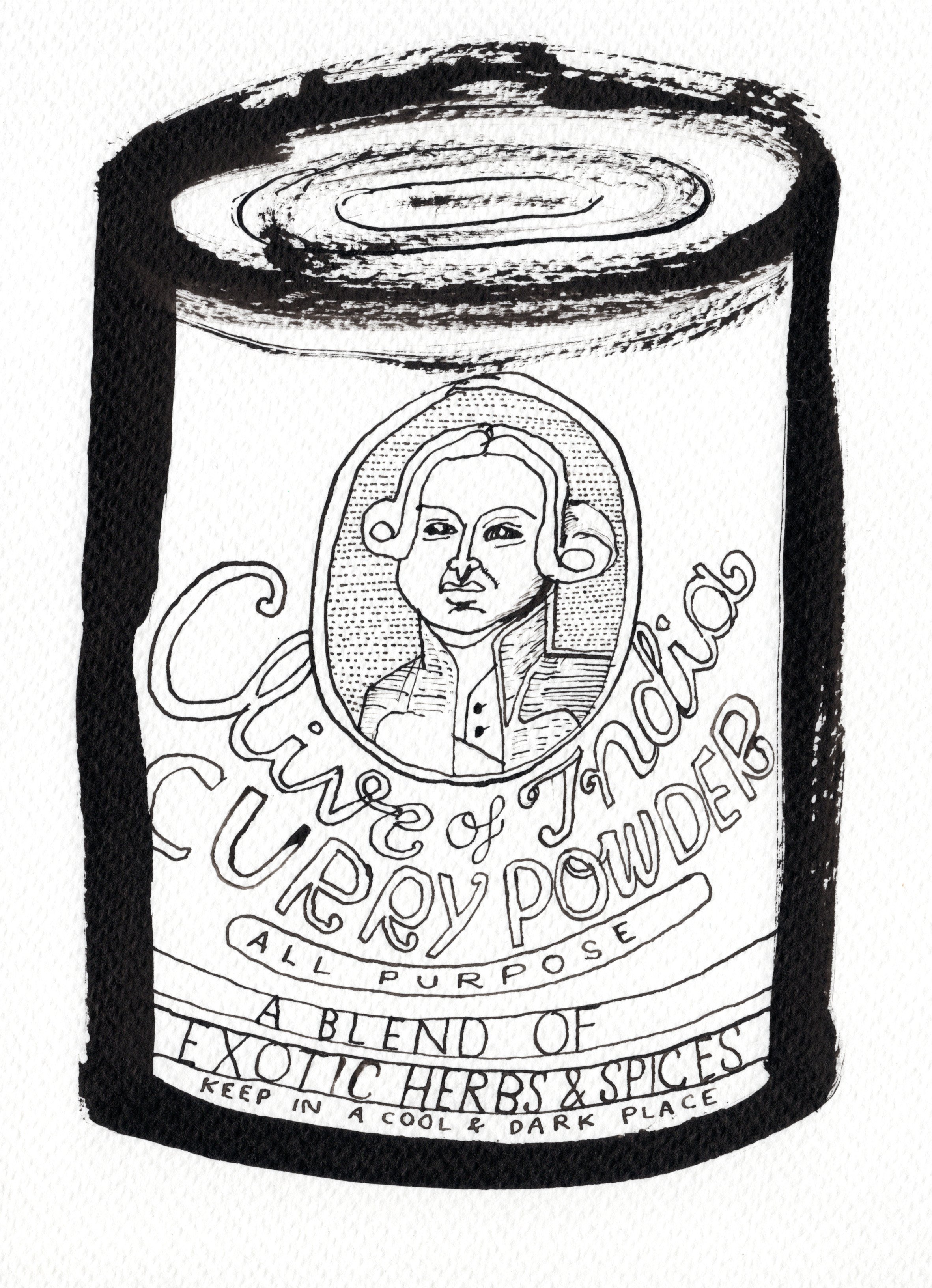
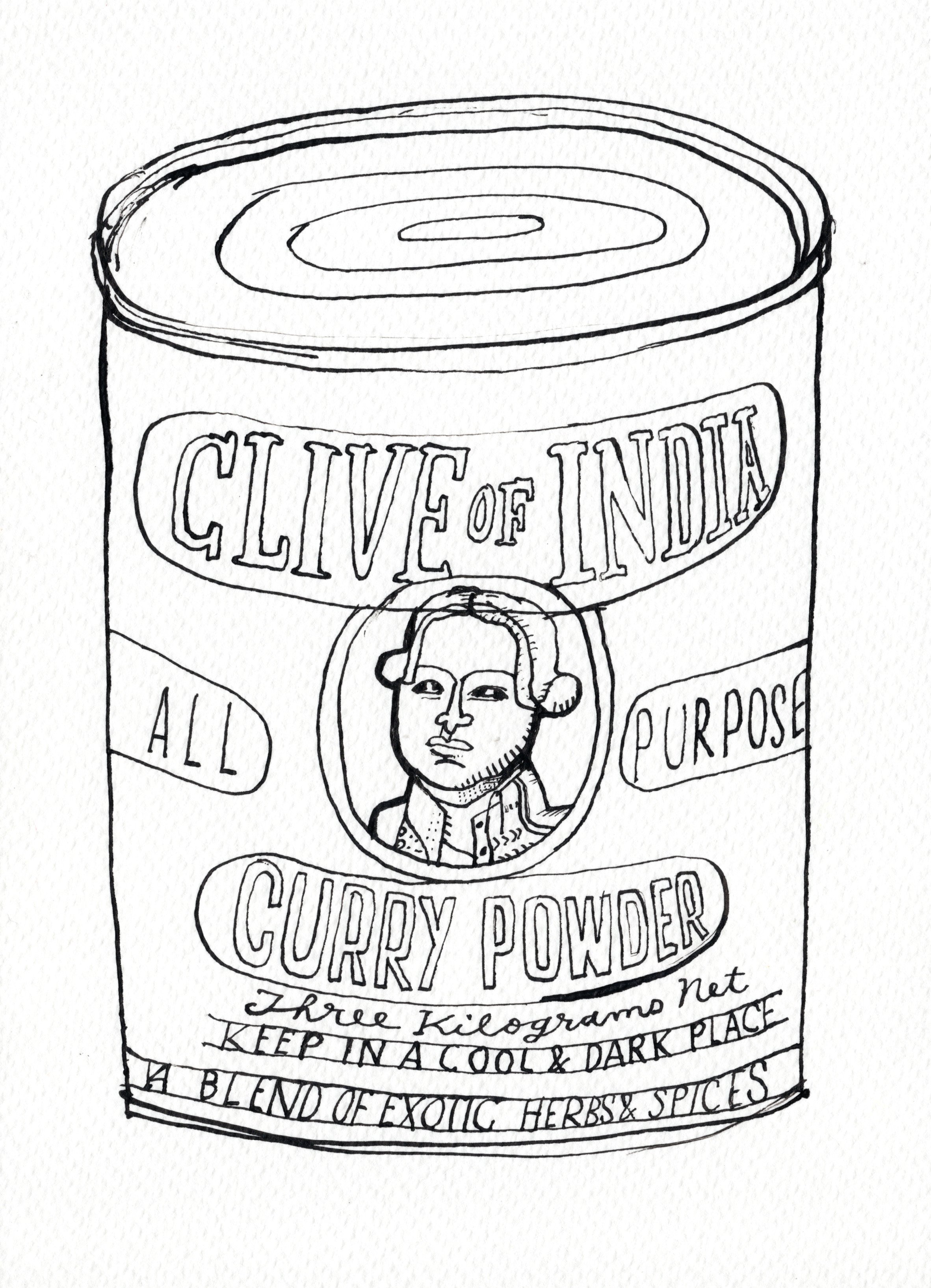
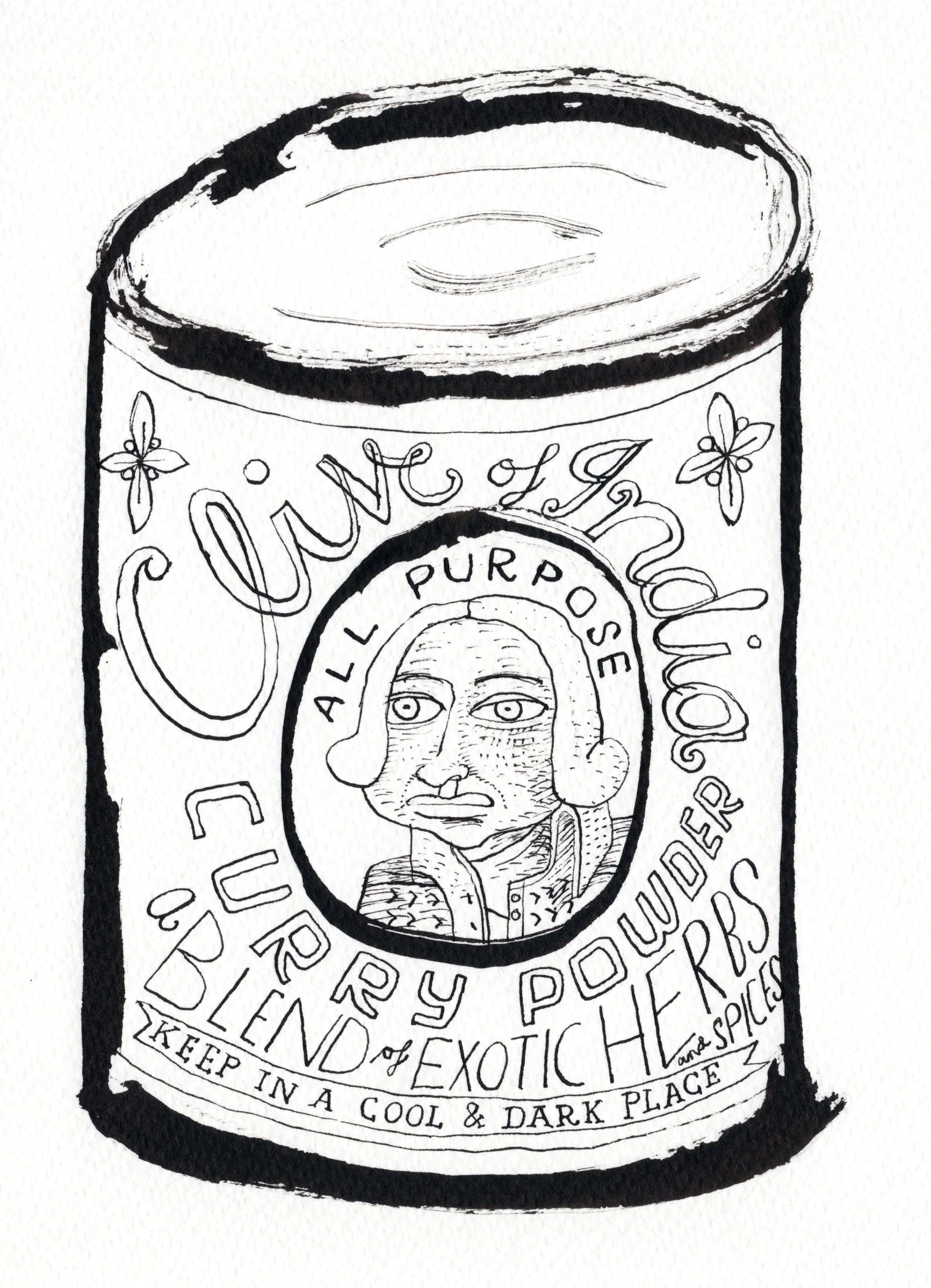
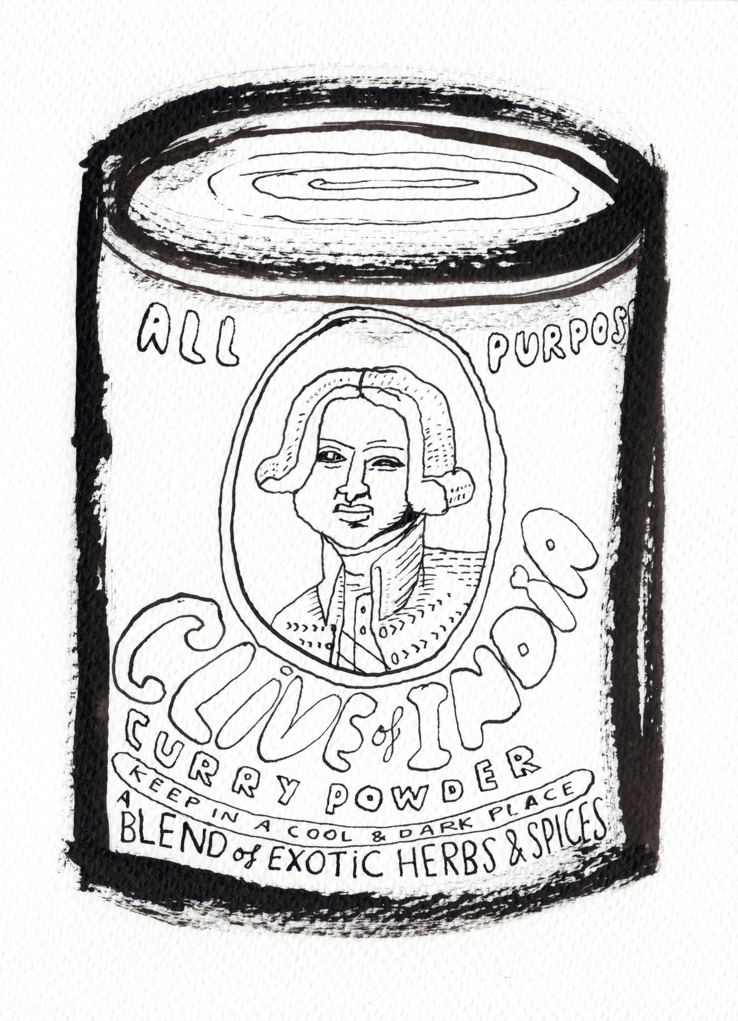
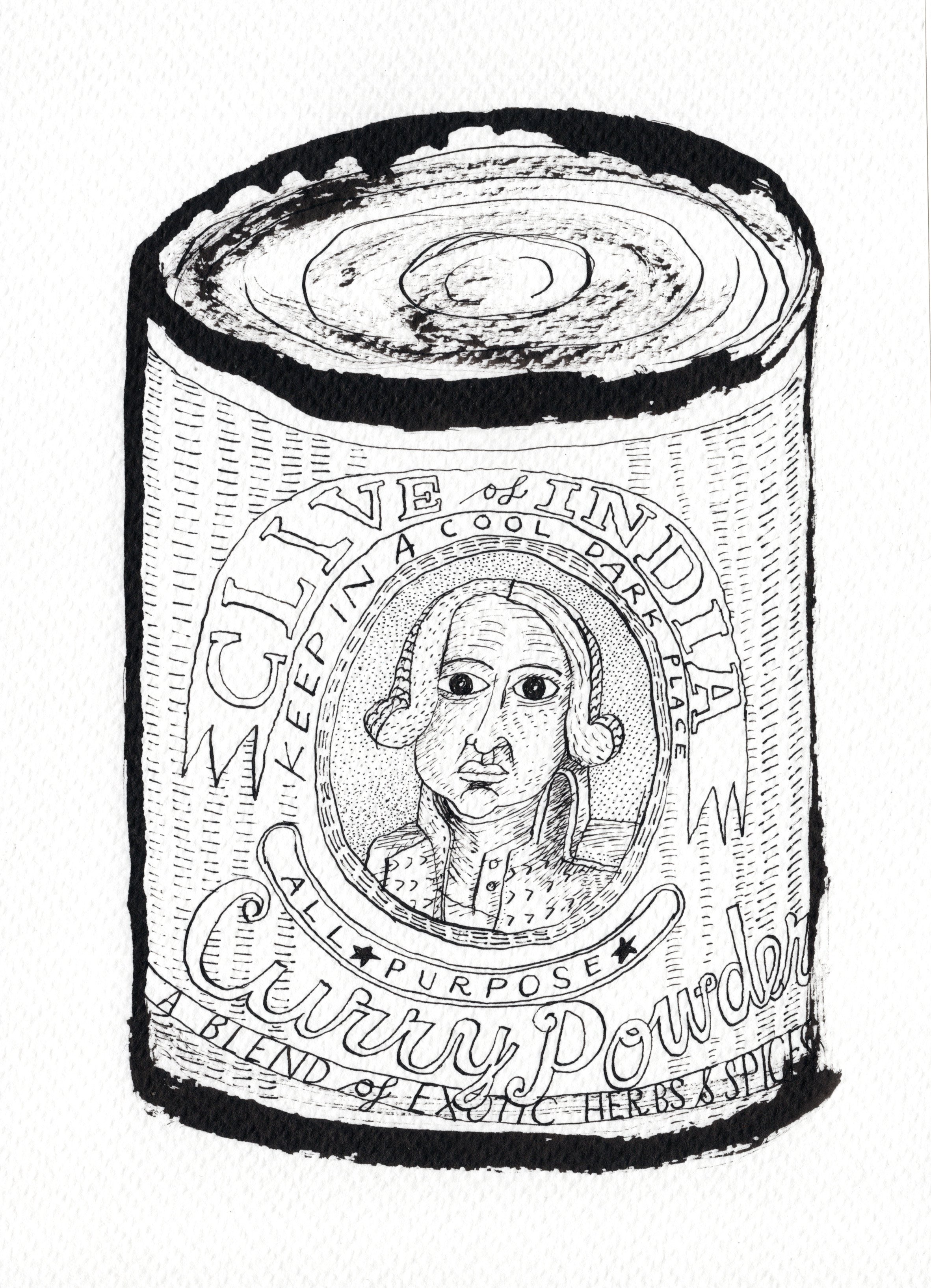
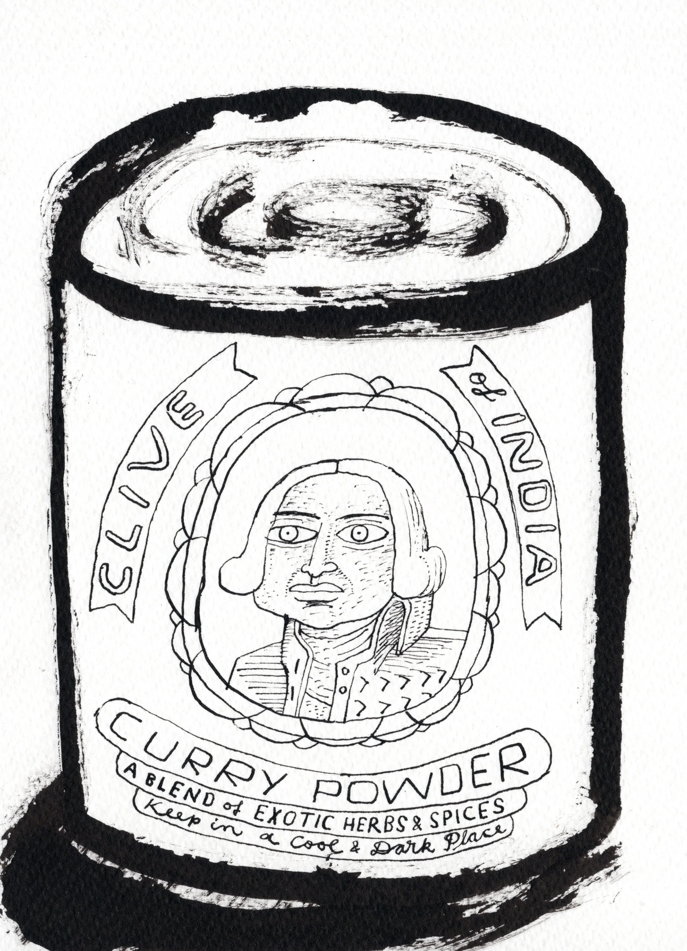
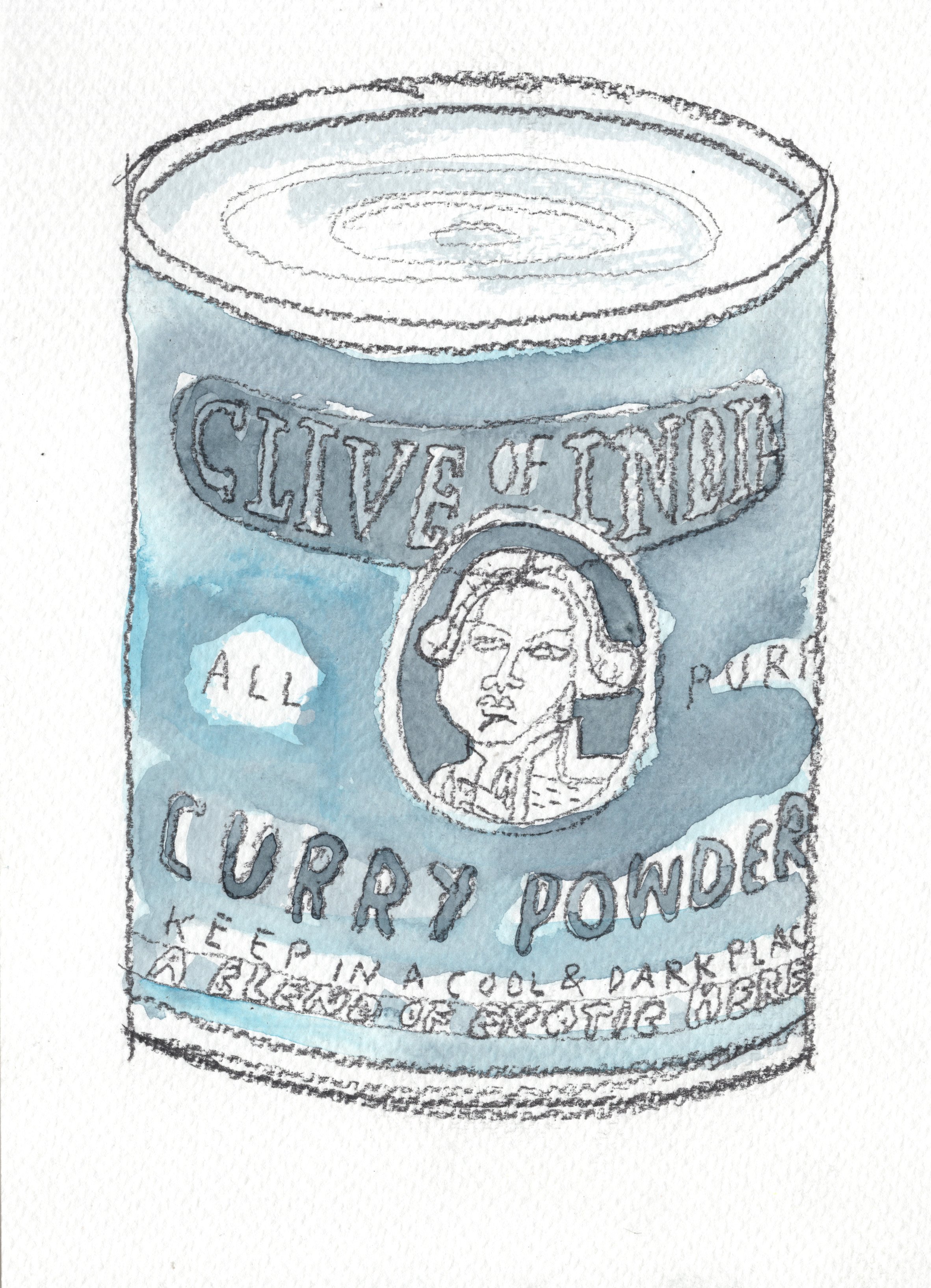
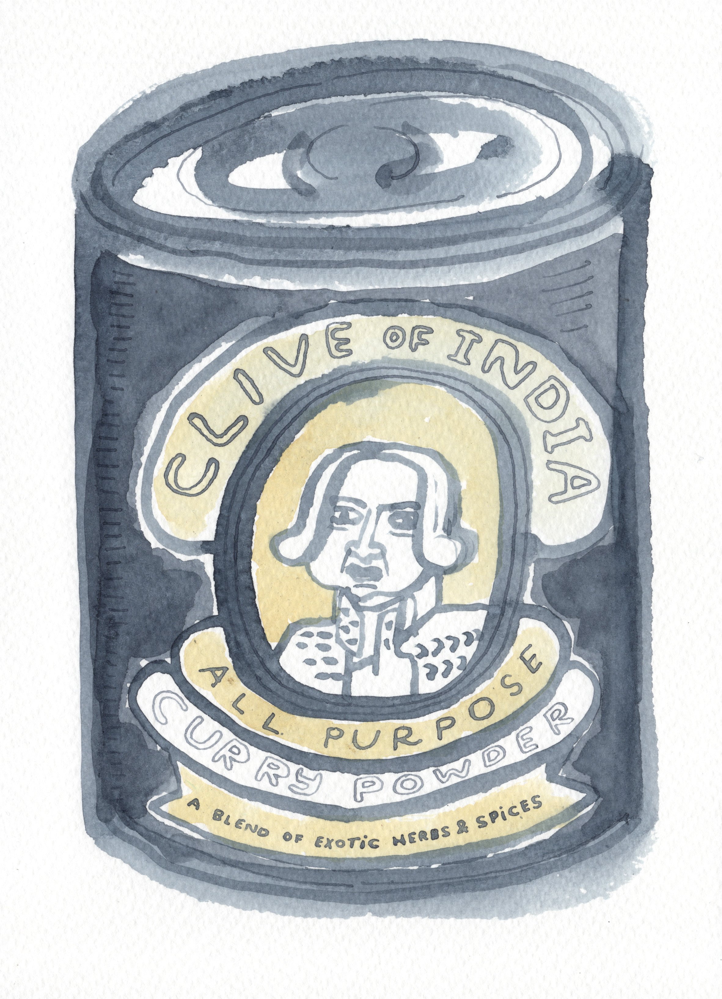
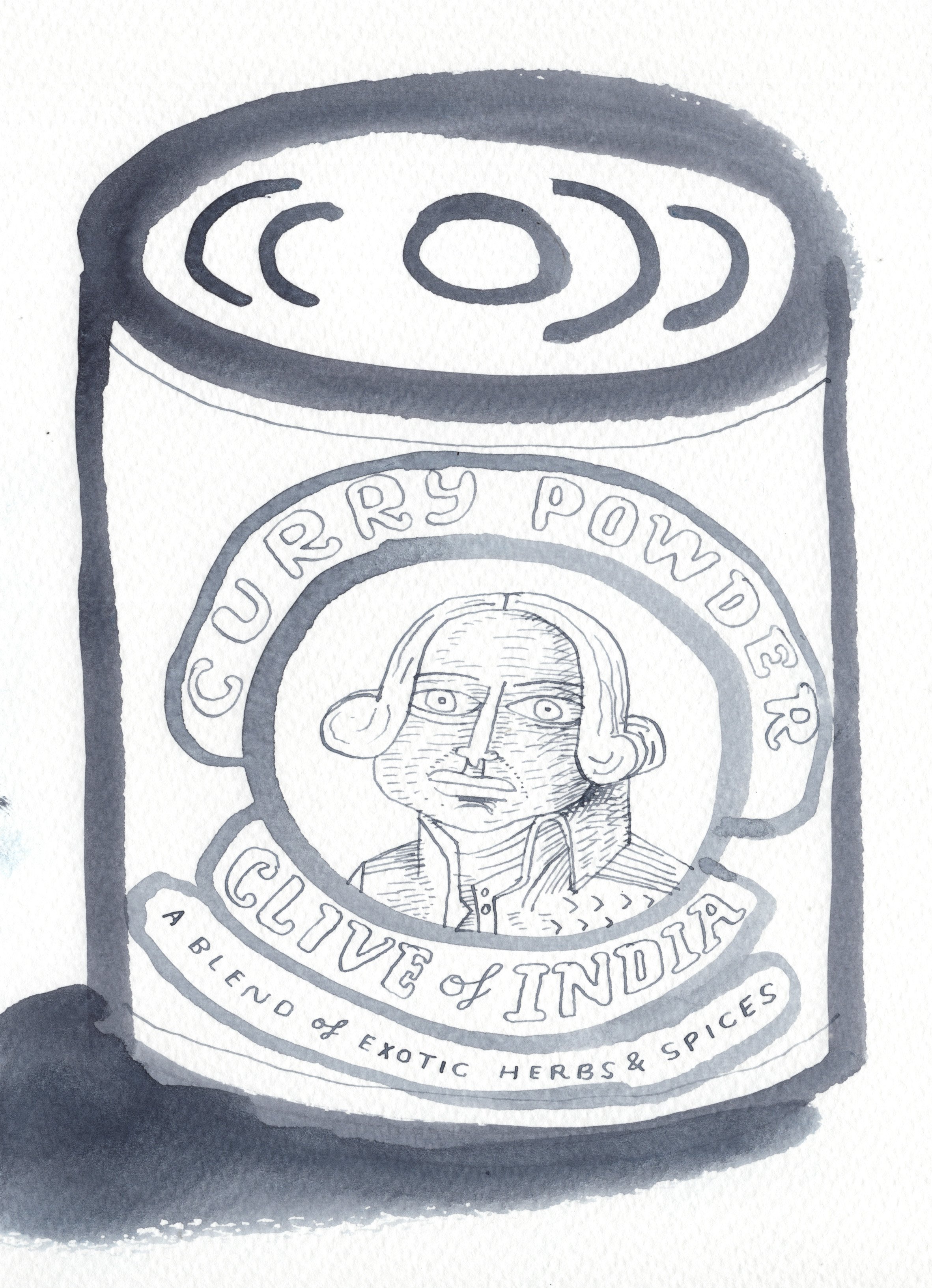
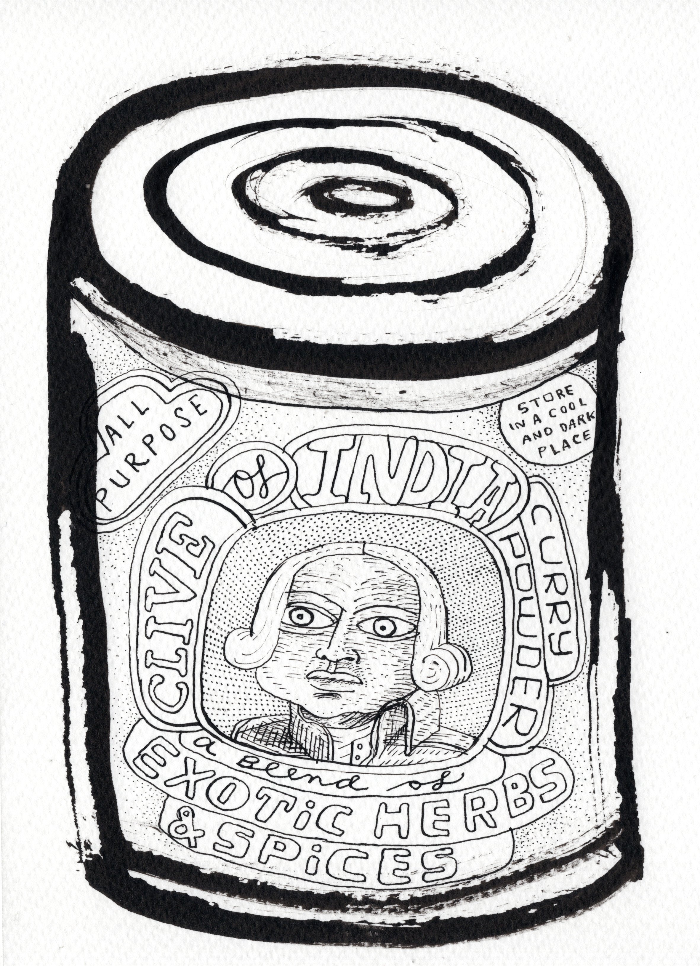
Growing up, I thought Clive of India must have been the inventor of curry powder.
But no, he wasn’t. And he had nothing to do with the production of curry powder.